Cogent
Brand design
Cogent is a consultancy which specialises in simplifying complex business processes and moving them to the cloud. I was asked to develop a clean identity to communicate this core purpose.
Although Cogent is all about the cutting edge and high-tech, I felt it was important to avoid any technical connotations and pursue something simple and friendly, which alludes to the customer benefits—after all, they're about making stuff simpler, not more complicated.
The cloud is a symbol many of us relate to remote computing, and it's long been the universal standard for thought. So combining the two seemed an obvious solution.
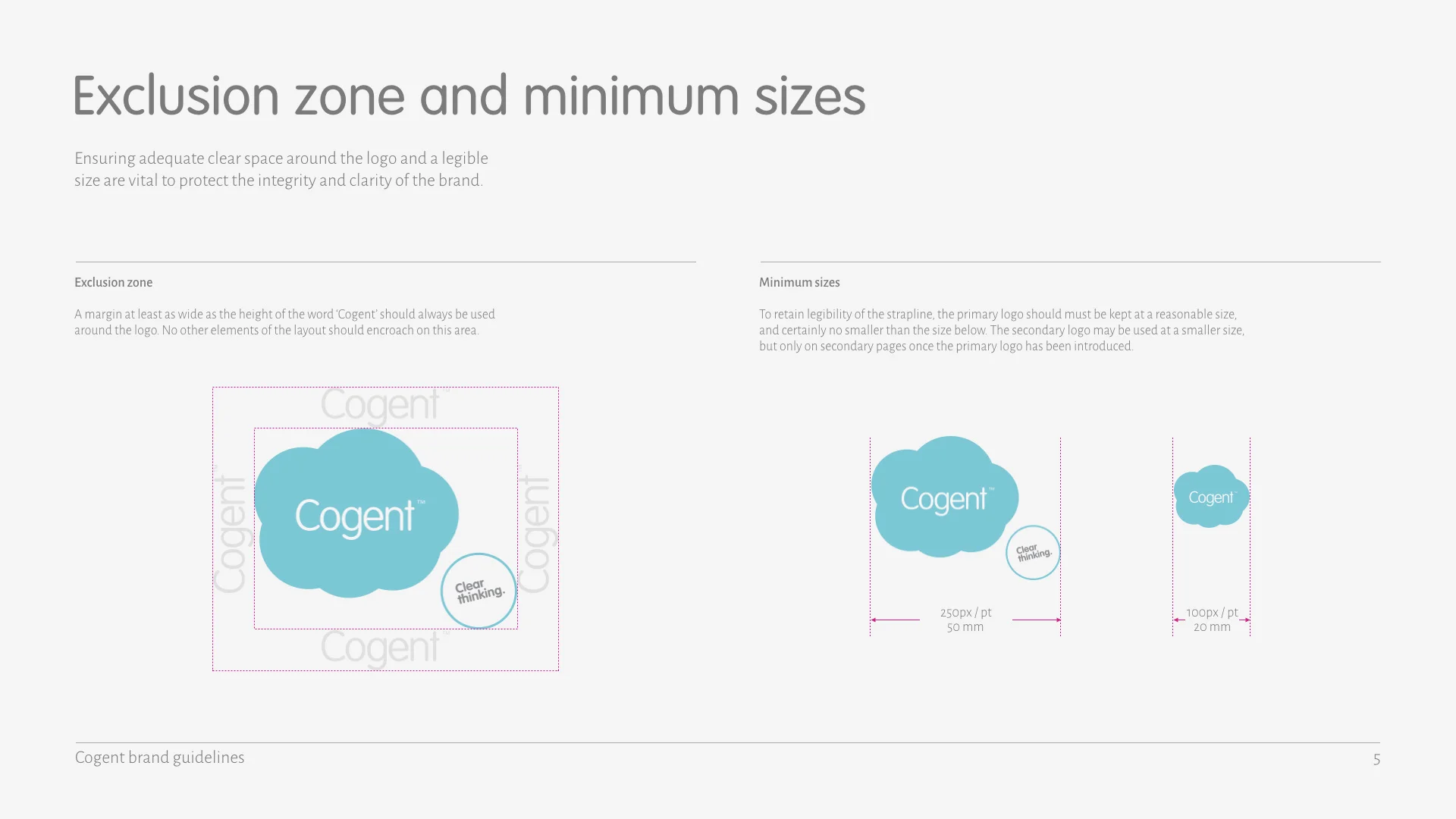
The 'clear thinking' strapline emerged from the first design phase, and gave two variations of the logo which can be used in different situations—with or without the extra circle. Without the strapline, it becomes a simple, bold marque with good legibility at smaller sizes.
Guidelines
A brand has to be useable, so I produced a concise set of guidelines which describe how the brand should (and shouldn't) be used.
The also-rans
Design is a journey; to reach your destination, some ideas have to be left at the wayside. Here's what we left behind.
1
This is the genesis of the final design. It was the favoured option from the outset, but the client felt the hand-drawn cloud took the design in too playful a direction.
2
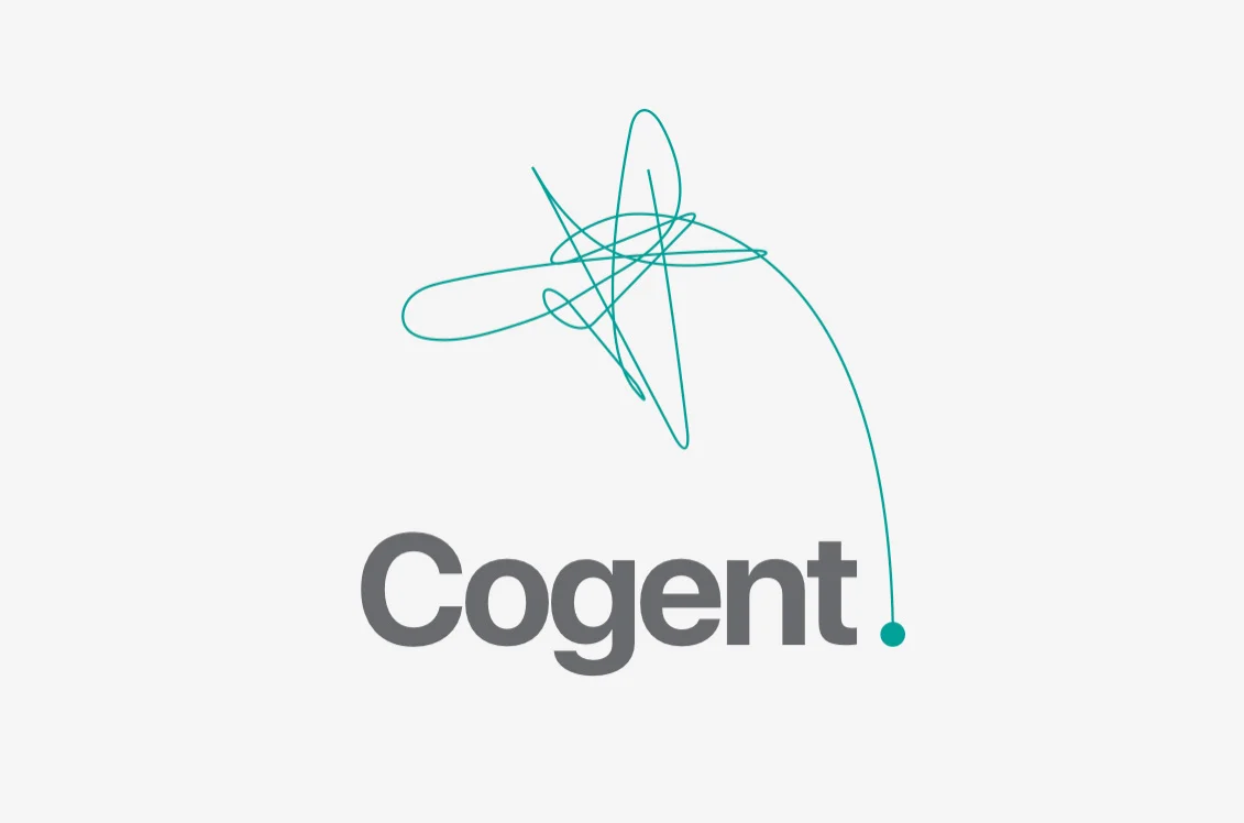
A simple visual illustration of Cogent unravelling the confusion of a business process. The full stop gives a bold suggestion of Cogent being the final word.
3
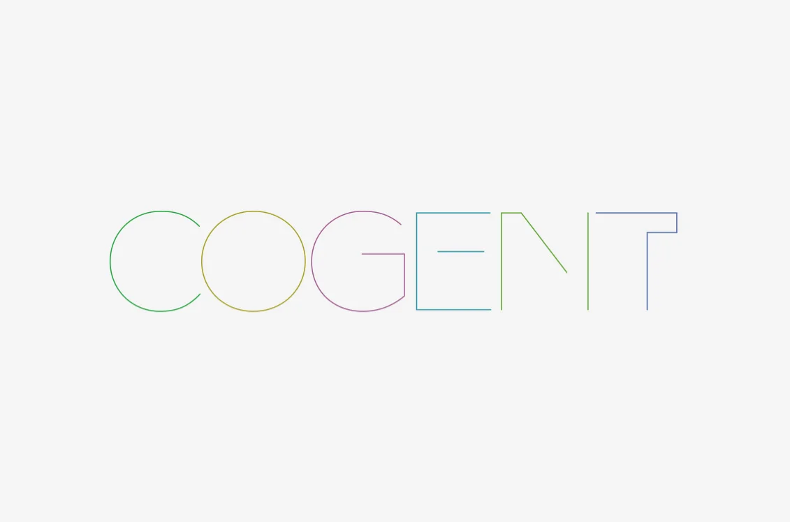
This route stemmed from the idea that the best technology is so robust you quickly forget it's there. Cogent's best work is, by definition, super-strong and completely transparent.


